Design, style, and ergonomics are all high up on my interests when it comes to the world. If you’ve got something that does something amazing, that’s great. But if using it makes me want to kill myself, then you’ve failed.
I’ve recently been working on designing a web page which visualizes the discovery of CVEs by a security company, in their so-called “Wall of Fame”. I absolutely hate their current design.
This is what greets you today:
 |
|---|
| The original “Wall of Fame” |
The neon colors hurt my eyes (especially when scrolling), and the wall of fame doesn’t tell any story: the wall is simply a list of CVEs, sorted by severity. The background “lights from the sky” (lol) move, by the way; it’s animated. As the wall fills up with high-severity CVEs, it will effectively never “update”, because the sorting will ensure that no new findings are ever featured at the top. That page was completely slopped up with AI, and nobody had the taste (or guts?) to say “this is ugly”. I think whoever said “this looks good for our brand”, has poor taste (I raise my chin high).
I think in the age of LLM-generated design, decisiveness, and the ability to say “no” is more important than ever. If you’re presented with anything and will always say yes, then you simply don’t understand design, and have poor taste. I think part of design is being deliberate, and picking the best and most effective representation of something for the intended audience; not just un-coordinated maximalist dumping (unless that’s the style itself). As I recently stated in a presentation, “if you’ll twerk to any song, maybe it’s not the music you like, but rather you just like twerking.”
I decided to experiment with the different ways I could represent this data, and make it… somewhat beautiful.
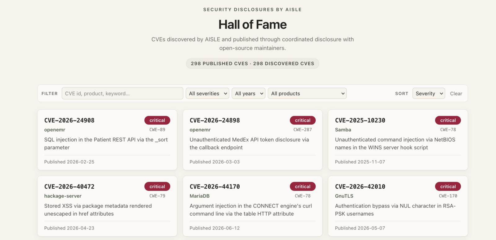
This one is the conservative take: the same wall, minus the neon. It’s fine, but no story.
 |
|---|
| A redesigned wall: a filterable, sortable list of CVE cards |
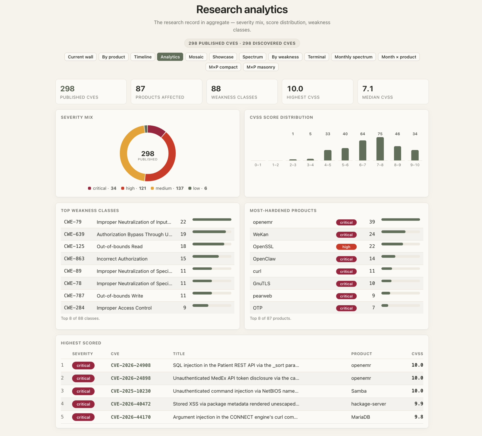
This one turns the record into aggregate statistics. Nice as a dashboard, but useless as a way to show off to the world.
 |
|---|
| Research analytics: the record in aggregate |
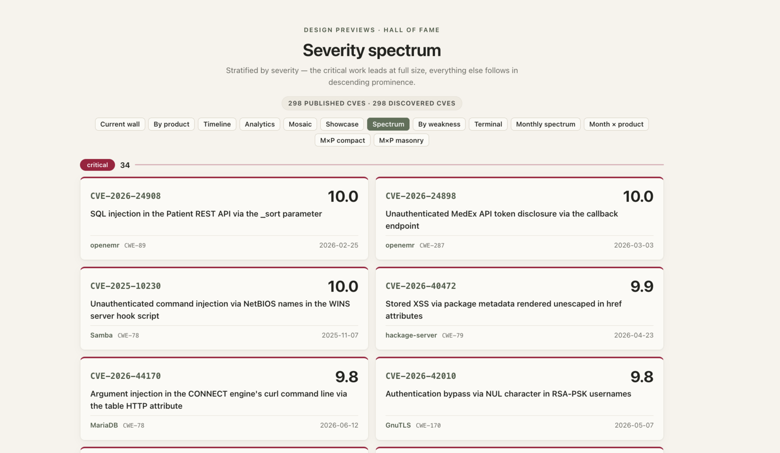
This one stratifies everything by severity, critical work leading. Kinda OK, but still so… chaotic with different projects, and so on.
 |
|---|
| Severity spectrum: stratified by severity, critical work leading |
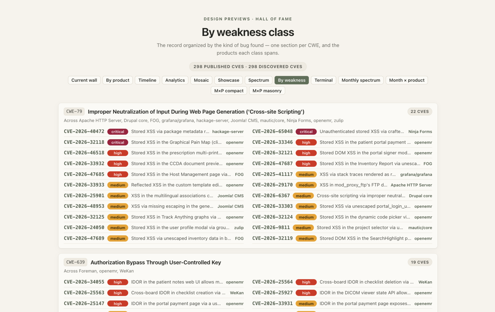
This one organizes the record by the kind of bug found. Useless.
 |
|---|
| By weakness class: one section per CWE |
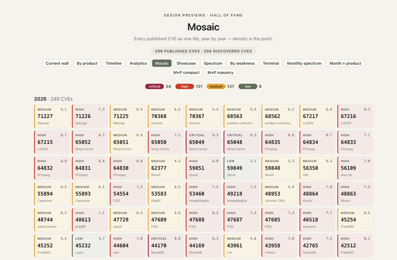
This one packs every CVE into a tiny tile. Looks cool, but useless.
 |
|---|
| Mosaic: every CVE as one tile — density is the point |
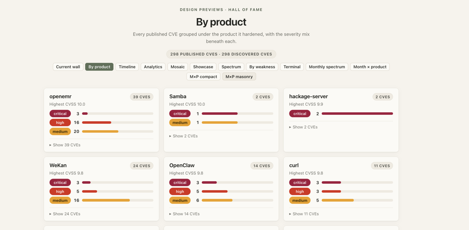
This one groups everything under the product it hardened. It’s fine, but no story.
 |
|---|
| By product: grouped under the product each CVE hardened |
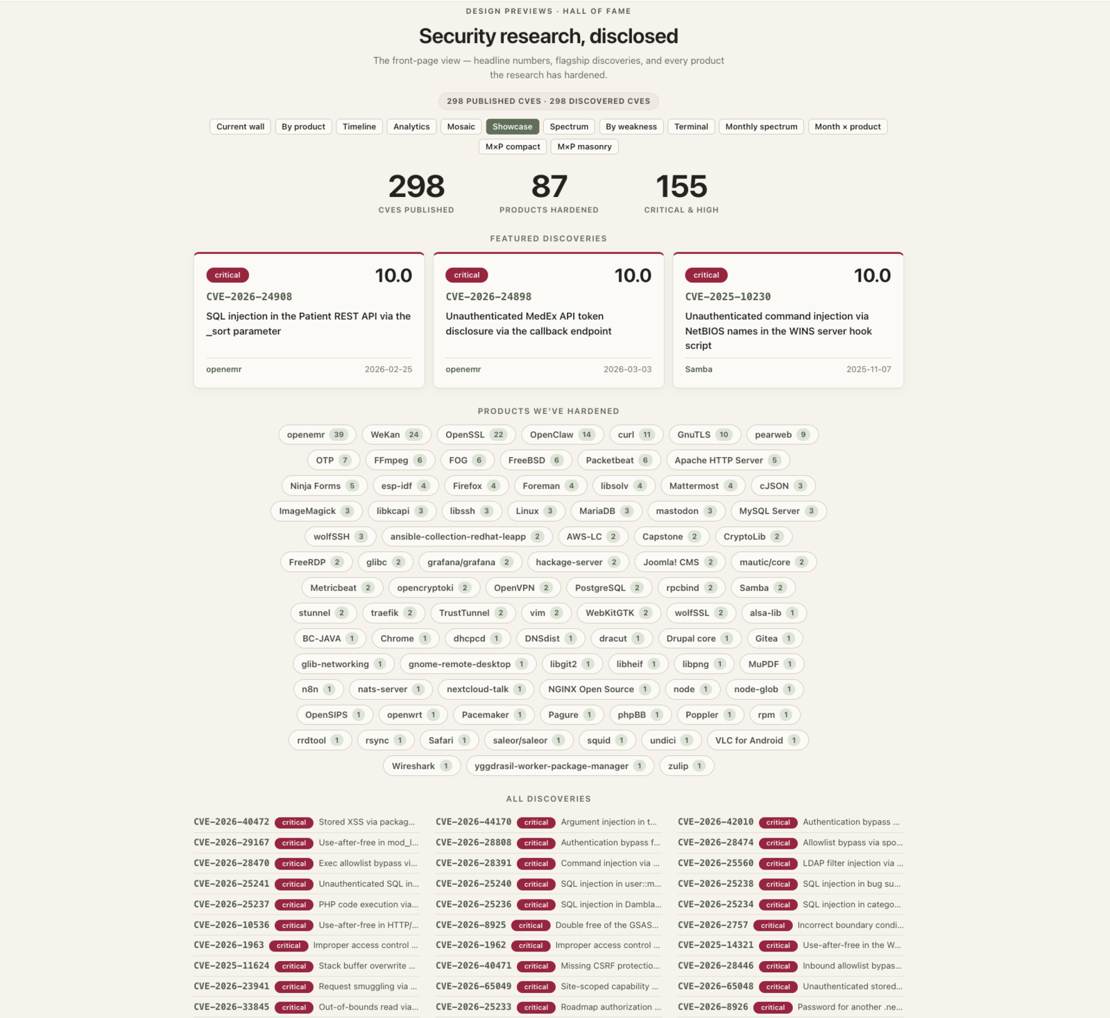
This one plays front page: headline numbers and featured discoveries. Useless.
 |
|---|
| Showcase: headline numbers and featured discoveries |
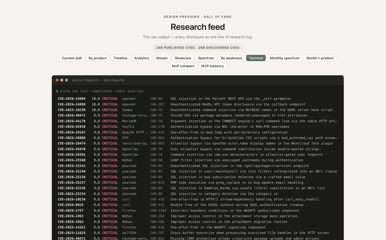
This one pretends it’s a research log in a terminal. Very cool! I like the colors and overall layout a lot! But suffers from the same issue as the original one, so useless.
 |
|---|
| Research feed: every disclosure as one line of research log |
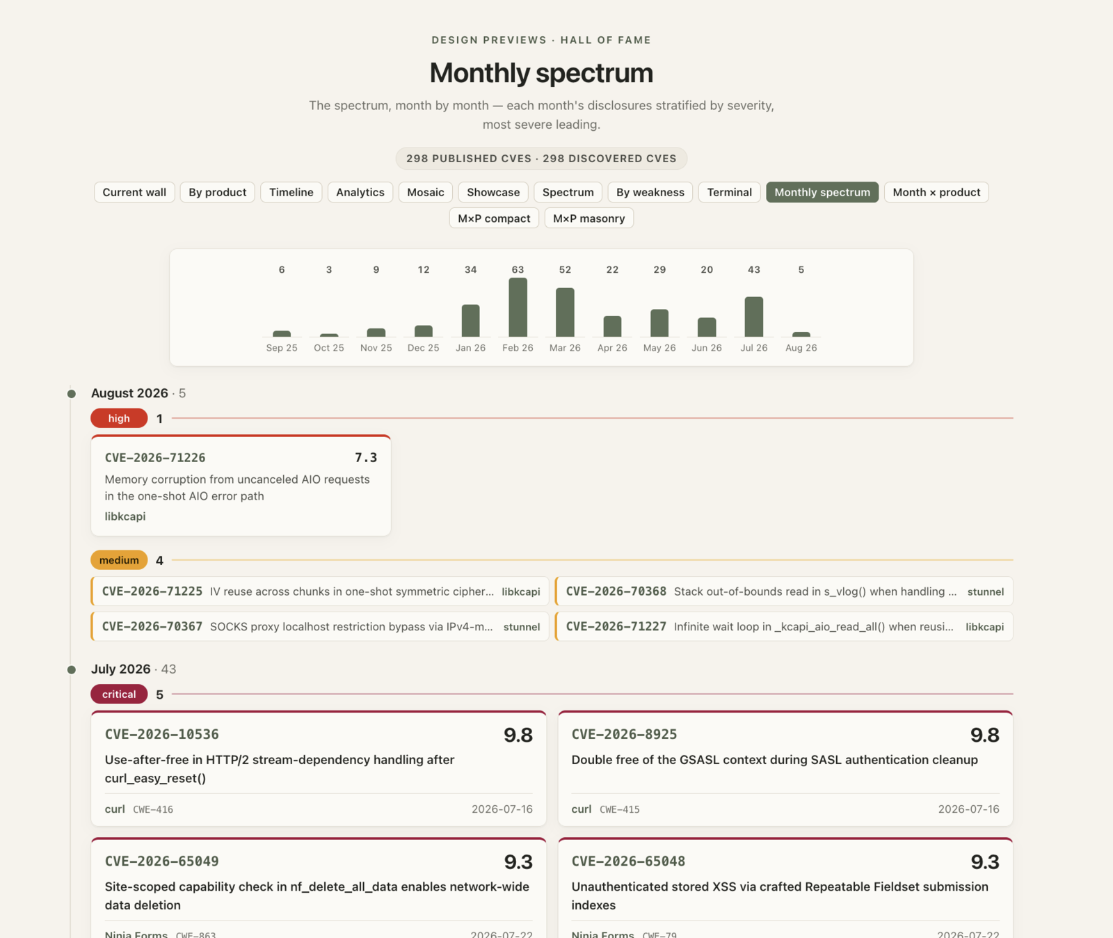
This one walks month by month, each stratified by severity. It’s fine, but again overly chaotic, and it’s not obvious which story it’s telling.
 |
|---|
| Monthly spectrum: each month stratified by severity |
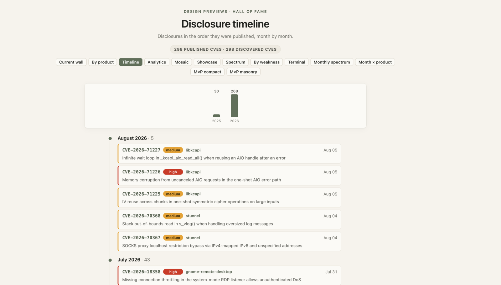
This one is a plain disclosure timeline, newest first. I like this one, but it again falls into the trap of “dump everything onto the screen and let the user work it out.”
 |
|---|
| Disclosure timeline: month by month |
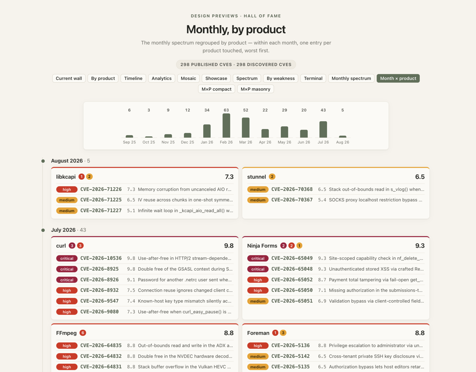
This one regroups each month by product. I like this one! It tells a story over a time horizon, while concisely showing each discovery, sorted by product.
 |
|---|
| Monthly, by product |
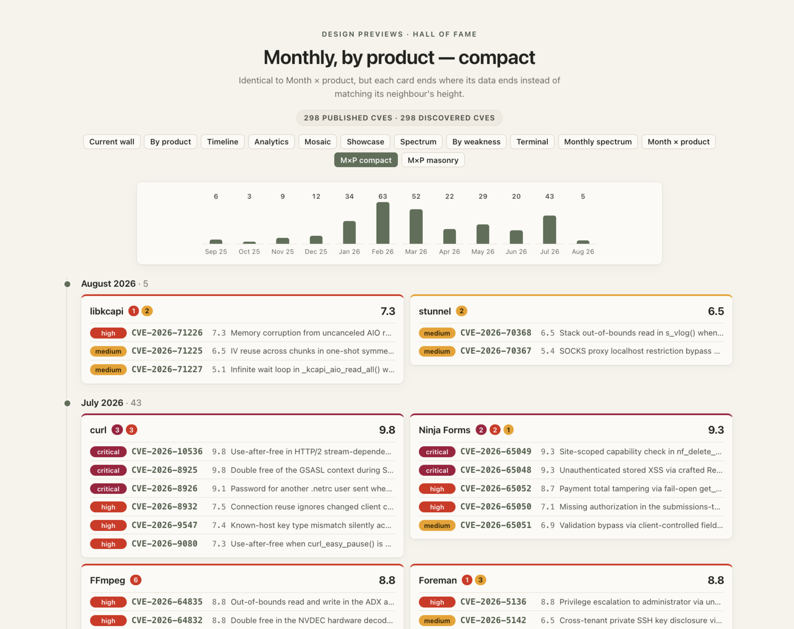
Same as above, but with some no uniform padding for each of the boxes.
 |
|---|
| Monthly, by product — compact |
In the end, I chose the last one. I think it tells the journey of finding the CVEs, by grouping them into projects for the month, and effecting communicates the data in a logical manner that just “makes sense” immediately when viewed.
I don’t think it’s any secret, but it seems to me that given the parameters, tools, constraints, materials, and actual goal of what is being designed, things aren’t so different from, say, a recipe, a mathematical equation, or an engineering problem: the design space may be broad, but it isn’t completely arbitrary. Good UX, in my humble opinion, comes from understanding those variables, their relationships, and the tradeoffs imposed by the problem, and knowing which parameters you have to play with – and knowing those parameters isn’t always so obvious. Certainly not to an LLM.
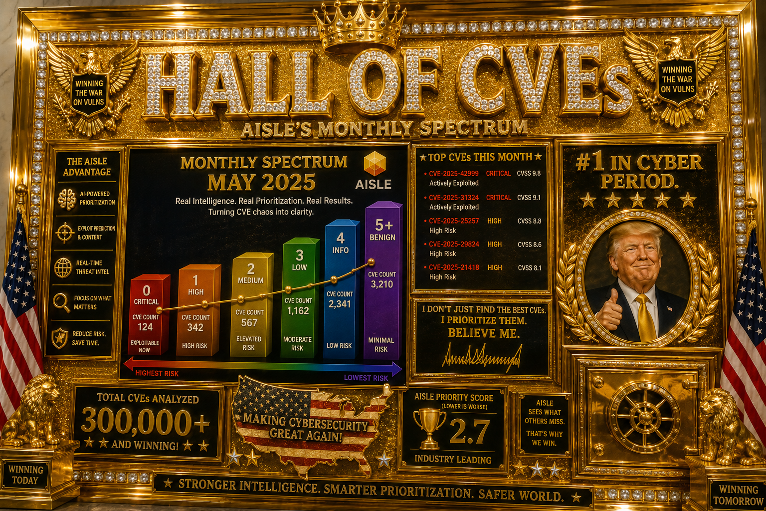
Tokens can’t buy taste. But, as I’m told, tokens can buy PEOPLE, who have taste. We could always go with this, though:
 |
|---|
| Hall of Fame in gold |